Quick explanation about the printing processes involved

To create the E95 baseball cards back in 1909 they started off with a black and white photograph and converted it to what is called continuous tone. This continuous tone is basically a pattern of dots that are large and thicker in dark areas and smaller and lighter in light areas. This dot pattern was used only for what would be printed in black. The other colors used were all exactly the color desired and not a combination of colors. Example: a green was a specific green ink. Today a combination of cyan (blue) and yellow over lap to create the appearance of green.

Today the modern technique of "4 color" printing or "4 color process" printing is used for any printed piece that has a wide range of colors. The Process color inks are: magenta(red), cyan (blue), yellow and black. As black and white photos were converted back then, today the same is done with full color photos which are broken down or color seperated into continous tone patterns, one for each of the 4 process color.

To get an idea about how the printing process of today as compared to back then - Click Here.


Detection 1: Printing technique. (For all collectors - beginners and advanced)
Original Card Reprint Card

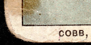
This is the front of an original E95 Ty Cobb card. As you can see, the "white" of the the outer border is really the white of the stock the card is printed on. There is NO printing of any kind in this area, except for the text.

Other elements to pay close attention to:

Black line surrounding the picture image: (Original) This border that surrounds the image is made up of ONE ink color - black. Even though it is not always even, It's edge quality is distinct and clean.

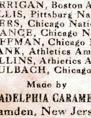
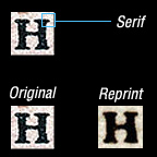
Text: (Original) The text is made up of one ink color - black. Edges are clean and distinct. Overall letter quality is nice and text has nice contrast to the surrounding "white" area.

You can also see in the picture area (his uniform) the dot pattern being used to create shades in the uniform. Note that only black ink is used with this technique. Note the gray of his uniform is one flat area in coverage and contains to dot patterns.

NOTE the even roundness of the corner. The reprint has "rounded" corners also when viewed with the naked eye but upon magnification you see what is actually a distinct purposeful cut angle.


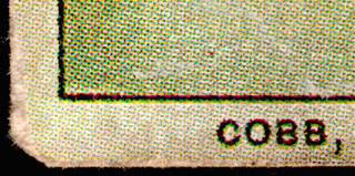
This is the front of a reprint E95 Ty Cobb card. When this set was reprinted they used the entire area of the card and converted everything to continuous tone dot patterns. This included the white outer border of the original. As you can see, the "white" of the the outer border now has printers dots covering the entire area of the border. The "white" border is now a light gray in appearance when viewed without any type of magnifying glass. This is a 100% sure sign the card is a reprint.

Other elements to pay close attention to:

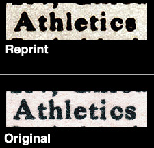
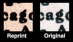
Black line surrounding the picture image: (Reprint) This line that surrounds the image is now made up of all four of the process ink colors. Since registration of a line like this is difficult with modern techniques, except from a very good print shop, in addition to black you can see areas of magenta, cyan and yellow used to create the lines appearance.

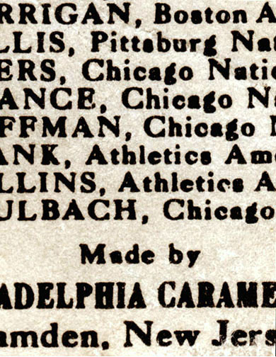
Text: (Reprint) The text is now made up of all four process ink colors also - magenta, cyan, yellow and black. Edge quality is very poor and the green color you see around the letters is created by the cyan and yellow inks overlapping. You also see areas of magenta around the edges of the lettering. Overall letter quality is poor and text has less contrast to the surrounding "white" area which now looks like a light shade of gray.


Detection 2: Quality to the text on the back. (Better for more advanced collectors)
I say this only because the quality of printing on cards in lesser condition can appear to be poor.


Reprint Card  

This is the back of a card from the E95 reprint set. EVERY time you take an item and copy it, scan it, Xerox it, or reproduce it in ANY way you will loose some level of quality. Depending on the technique, you will lose a little or a lot. These cards were reproduced in such a fashion that a lot of the quality was lost. Purposely? Maybe, I like to think so. The first thing to look for is the overall quality of the text.

Overall letter quality. If you look at the overall quality of the letters you not that they are not very sharp. The text seems to look 'blurry". Edges are dull, serifs* are severely rounded off and blunt, the overall shape of lettering is very poor. For close comparison, see image 1, below.

Serifs* are the little protrusions added to the ends of letters. You see them going off to the right and left at the top and/or bottom of the line strokes of the capital "A", "N", "H" and "I" as well as other letters.

Reversed out areas of letters and finer details of letters. Using the "a", "e", "g", "s" as in Chicago, Athletics, Pittsburgh and Boston. Note on the reprint version the "s" just looks like 2 oval shapes stacked on top of each other. The "g" has areas filled in completely and as does the "a" and the top half of the "e". Some of the finer areas within the overall shape of the letter such as the "g" and the "s" are so far gone and they just look like black shapes, and no longer look like letters at all. For close comparison, see image 2, below.

Serifs: The serifs very poor quality and where they meet the stroke of the letter a rounded shape is identifiable. For an example, see image 3, below.


Original Card  


This is the back of a card of an original E95.

Overall letter quality: Notice the quality of the text. This text seems much "lighter" in overall appearance and notice the edge quality of the individual letters is much sharper. The horizontal stroke of the capital "H" is fine and there are corners created where they meet the vertical stroke. On the reprint version these corners are severely rounded.

Reversed out areas of letters and finer details of letters: Most importantly here is that you can easily identify the "s" as an "s", the "a" as an "a" and so forth. The reversed out areas within the "a", "e", "g" are clearly open and help identify the letter.

Serifs: The serifs are better quality and where they meet the stroke of the letter a corner shape is identifiable. For an example, see image 3, below.


Image 1
Image 2
Image 3


Back | Printing Comparision | Home